It’s about a 4 min. read.

Back in the old days (2002?) if you wanted a frozen treat—you ordered from the nice person at the TCBY counter, paid your money, and went on your way. Then Red Mango came to town and it was a game-changer. Now instead of someone else building my treat, I had total control—if I wanted to mix mango and coffee and throw some gummy bears on top I could—I didn’t though, I’m not a monster.
Of course, there was a downside—sometimes I’d walk away with a $15 froyo. Sometimes, there is such a thing as “too much of a good thing”. As a data manager, knee-deep in interactive data viz, I know this applies to dashboards as well as dessert.
When starting a dashboard from scratch, there’s the same potential to go overboard, but for different reasons. Like flavors and toppings, there are many viewer design and build directions I could take. Will the dashboard be one centralized page or across multiple pages? What types of charts and tables should I use? What cuts should be columns and which should be filters?
The popular platform, Tableau, has so many options that it can often feel overwhelming. And aside from design, Tableau lets users deep dive into data like never before. With so many build options and data mining capabilities at our fingertips, what’s a designer to do?
Forget the gumdrops and jalapeño flavored yogurt—I encourage our clients to go back to basics and ask:
The content and design of a well-made dashboard should depend on its purpose and end user. The dashboards I create in my spare time (yes, it’s also a hobby !) are very different than the ones I build for clients. For example, a deep-in-the-weeds analyst will need (and appreciate) very different functionality and design than a C-suite level user would. An analyst interested in deep-dives may need multiple filters and complex tables to cut the data every which way and investigate multiple scenarios, whereas a c-suite level needs a dashboard that answers their questions quickly and directly so they can move forward with business decisions.
It may be tempting to add flashy charts and lots of filters, but is it necessary? Will adding features help answer key business questions and empower the end user, or will it overwhelm and confuse them?
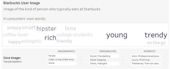
Here’s a snippet from a dashboard that an executive could glean a good amount of insight from without feeling overwhelmed:

Depending on what business questions the client is trying to answer, the design around specific types of dashboards may vary. For example, a brand health tracker dashboard could be a simple set of trending line charts and callouts for KPIs. But it’s rare that we only want to monitor brand health. Maybe the client is also interested in reaching a particular audience. So as the designer, I’ll consider building the audiences in as a filter. Perhaps they want to expand into a new market. Divide your line charts by region and track performance across markets. Or maybe they need to track several measures over time across multiple brands, so rather than clog up the dashboard with lots of charts or tabs, you could use parameters to allow the user to toggle the main metric shown.
When I plan to build and ultimately publish a dashboard to Tableau Public, I consider what elements will keep the user engaged and interested. If I’m not sure of the answers I force politely ask my friends, family, or co-workers to test out my dashboards and provide honest feedback. If my dashboard is confusing, boring, too simple, too convoluted, awesome, or just lame, I want to know. The same goes for client-facing dashboards.
As a data manger, my goal is to create engaging, useful data visualizations. But without considering who my end user is and their goal, this is nearly impossible. Tableau can build Pareto charts, heat maps, and filters, but if it doesn’t help answer key business questions in an intuitive and useful way, then what’s the point of having the data viz?
Just because you can mix mango and coffee together (and even add those gummy bears on top), doesn’t mean you should. Like TCBY and Red Mango with their flavors and toppings, Tableau offers infinite data viz possibilities—the key is to use the right ingredients so you aren’t left with a stomachache (or a headache).
Blair Bailey is a Data Manager at CMB with a focus on building engaging dashboards to inform key business decisions and empower stakeholders. Her personal dashboards? Less so.